Topics covered in this post
- How to add titles and subtitles to your Matplotlib charts using
plt.suptitle- Tips for working with
plt.suptitle- Pros and cons to adding subtitles
Why should you add headlines or subtitles to your charts?
Effective data visualisation is a vital skill for communicating outputs to stakeholders.
However, in general, visualisation for business communication is not something that is taught well in school or university courses. In these academic environments, we are told the purpose of the chart title is purely functional and should only describe the quantities being plotted on the x and y axes.
Functional titles tell the reader what the graph is plotting, but nothing about what the graph is showing or why this is interesting. In the business domain, this academic approach often falls short and misses a great opportunity to drive home your message.
The outputs of your analysis will likely be viewed by many different business stakeholders with varying familiarity with your dataset. You need to cater for this fact in order to generate the most impact from your visualisation.
One of the best ways to improve the accessibility and persuasiveness of visualisations is to add descriptive subtitles to your charts. These act as ‘headlines’ containing the key take-home message which aids your audience to interpret the graph for themselves.
Leave your audience in no doubt about what the visualisation is showing them and why it is important to them.
How can you add subtitles to Matplotlib charts?
Matplotlib is the defacto method for visualising data in Python.
Adding titles in Matplotlib is very easy – just use plt.title .
However, there is a handy, but less well known function called plt.suptitle which allows you to add a second title (subtitle) to your charts.
In theory you could use plt.title as your headline. However, I like to use plt.suptitle to create a headline with my key message and then use plt.title for the more conventional title that describes what is being plotted.
Let’s demonstrate with an example.
Code and further examples are provided in this notebook in the e4ds-snippets GitHub repo.
There has been a lot of negative news about streaming services such Netflix and Spotify. Let’s visualise how this has impacted their share price performance.
Load data
Requires installing ffn library to collect data and matplotlib to create the visualisation
pip install ffn matplotlib
import ffn
import matplotlib as mpl
import matplotlib.pyplot as plt
import matplotlib.dates as mdates
# load daily stock prices from yahoo for Spotify and Netflix
tickers = ["SPOT", "NFLX"]
prices = ffn.get(tickers, start="2020-01-01", end="2022-04-28")

# rename the columns to their more common names
prices.columns = ["Spotify", "Netflix"]

# rebase prices so they are indexed to 100 from 1st January
rebased = prices.rebase()
Plot a graph with ‘normal’ title
SPOTIFY_GREEN = "#1DB954"
NETFLIX_RED = "#e50914"

# plot
rebased.plot(figsize=(12, 8), color=[SPOTIFY_GREEN, NETFLIX_RED])
plt.title(
    "Spotify and Netflix's share price rebased to January 2020",
    fontsize=14,
    pad=10,
    loc="left",
)
plt.show()
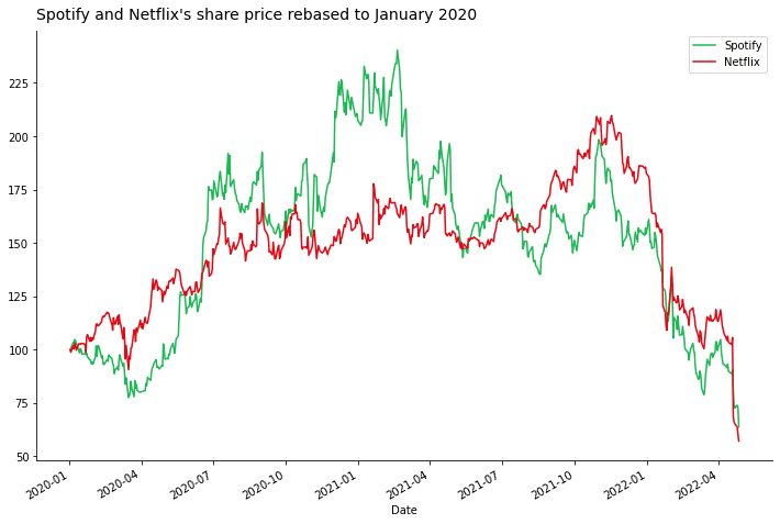
Without any context, it is difficult to immediately understand what is interesting about the graph. As a consumer of the visualisation you need to spend at least 30 seconds interpreting the title and the contents of the graph, before you can gain any insight.
As an analyst, by not including your take-home message in the chart you are missing a golden opportunity to deliver your conclusion. Potentially reducing the impact of your analysis if the stakeholder does not interpret the chart correctly or doesn’t have the bandwidth to even try and understand it.
Make it easy for them!
Add a headline with plt.suptitle
Now lets improve the chart by adding a headline to clearly show the take-home message using plt.suptitle.
rebased.plot(figsize=(12, 8), color=[SPOTIFY_GREEN, NETFLIX_RED])

plt.title(
    "Spotify and Netflix's share price rebased to January 2020",
    fontsize=14,
    pad=10,
    loc="left",
)

plt.suptitle(
    "Investor sentiment has turned on the streaming business model",
    fontsize=16,
    fontweight="bold",
    x=0.126,
    y=0.96,
    ha="left",
)
plt.show()
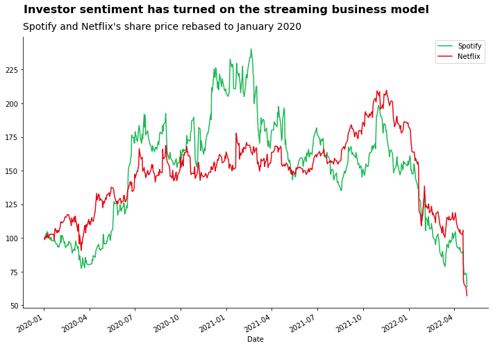
The updated chart now has two titles: a headline with a key message, and the original title. The headline should complement the original title and provide extra context on the key message you are trying to show from the visualisation.
In this example, I have chosen to convey that the message from the chart is a sharp change in the attitude of investors towards these stocks. Investor sentiment is manifested in the prevailing stock price which we can monitor over time. Hence, the large decline in the share prices of Spotify and Netflix since the pandemic highs support a change in attitude from investors.
Note there could be other take-home messages for this graph. The message you want to convey really depends on the angle of analysis and the stakeholders you are presenting to. It should be tailored for your specific use case.
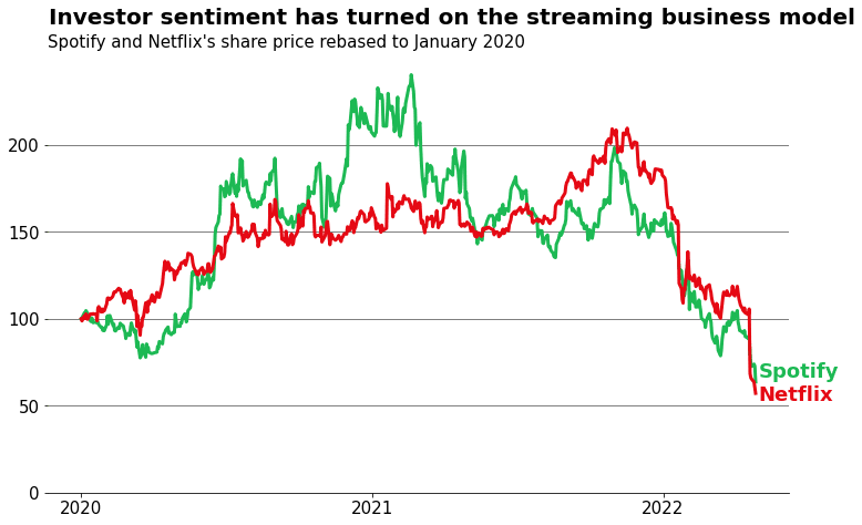
Note: There are definitely still things we can improve about this graph. For example, removing some of the unnecessary axis labels and adding gridlines to allow users to read across the graph values more easily.
See the accompanying notebook for a more complete visualisation shown below
Tips for working with plt.suptitle
Placement: How to position suptitle
I have to admit, working with plt.suptitle can be cumbersome to use. Particularly when it comes to getting the placement correct.
You can change the location of the subtitle using the x and y arguments. Normally, the default placing causes some overlapping of the normal title or chart canvas. Experiment with the y coordinate to move it above the rest of the chart – it might need some trial and error to get it right.
In the example above it turned out y=0.96 was required to get the vertical position ‘correct’. Sometimes you might need to use a value greater than 1.
By default, the subtitle will be centred. If you want to align the subtitle to the left, unfortunately, it is not as straightforward as using loc='left' as with plt.title. In the example above I had to experiment with the x coordinate until I settled at the x=0.126 value to place the subtitle above the normal title.
Formatting: How to differentiate your headline
I also recommend changing the font size and weight so that the headline stands out against the other title and chart text.
This can be achieved by passing values for the fontweight and fontsize arguments.
Things to consider when adding subtitles with Matplotlib
You do not have full control over styling
As with a lot of the Matplotlib API, it can be cumbersome to fully customise.
Beyond changing the font size and weight of the entire headline, there isn’t much you can do. For example, if you wanted to highlight specific words in the headline for extra emphasis (e.g. matching the word’s colour to the relevant colour on the plot).
Sometimes Matplotlib isn’t the best tool for the job. If you need highly customised charts it is better to export the results to Excel or a photoshop software to make edits using a GUI instead of trying to code it.
Not easily automated
The point of the headline is that it conveys a specific message about your chart. If you are creating a weekly report and the numbers, and therefore the take-home message of the chart, changes then you will have to manually update it to make sure it still makes sense.
Additionally, getting the placement coordinates correct requires a little bit of trial and error. The coordinates for the correct placing of the headline can change if the data and dimensions of your chart change.
Don’t bias your stakeholders
While it is important to clearly convey your message, you should not use a headline which overly biases the conclusion your stakeholder reaches. The headline should be an aid for understanding rather than a narrow viewpoint.
Conclusion
Adding a headline to your charts can help your audience understand and engage with your data more easily. The headline clearly summarises the key takeaway from the graph which allows you, the analyst, to convey your message more impactfully.
You can use Matplotlib’s plt.suptitle feature to add a second title to your graph which can serve your key takehome message to stakeholders.
However…
You should always use the right tool for the job. Very often, Matplotlib isn’t the best tool for visualisation. It is quite cumbersome to use for creating highly customised visualisations. Sometimes it is better just to crunch the numbers using Pandas/Python and then export the results to Excel or Adobe Lightroom to create the final custom visual.
Sometimes a headline to a chart is not always required. For example if it is a chart that is generated and inspected often by the team – i.e. they are familiar with the contents and how to interpret it.
Happy coding!
Resources
- UK Office for National Statistics - Handy guide for presenting data
- FlowingData - Great resource for learning data visualisation
- Accompanying GitHub Code
Further Reading
- Reproducible ML: Maybe you shouldn't be using Sklearn's train_test_split
- Why is machine learning deployment so difficult in large companies
- How to set up an amazing terminal for data science with oh-my-zsh plugins
- Data Science Setup on MacOS (Homebrew, pyenv, VSCode, Docker)
- Five Tips to Elevate the Readability of your Python Code
- SQL-like Window Functions in Pandas
- Do Programmers Need to be able to Type Fast?
- How to Manage Multiple Git Accounts on the Same Machine